Visual communication, web video and data visualization course websites with open materials

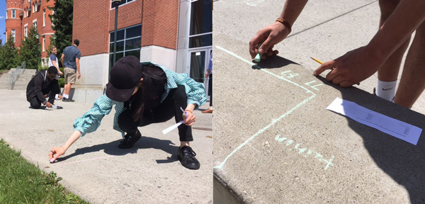
Rural Reporting Project, a news experiment about student journalists reporting in small communities in our region

What I've learned about teaching from the OpenNews community

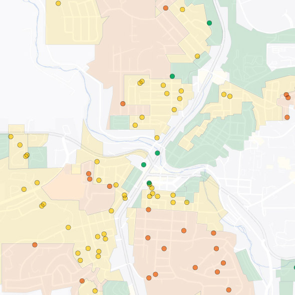
A Whitman County Watch project about how most Airbnb listings in Pullman don't comply with current zoning codes

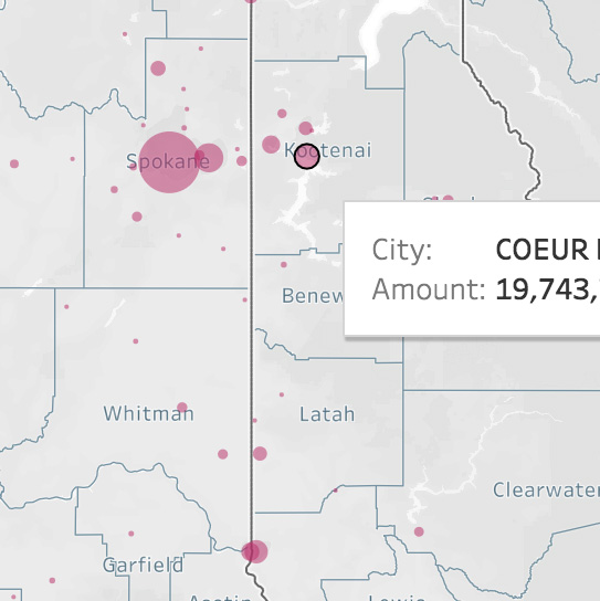
Data analysis and visualizations to Localize opioid prescription data from the Washington Post/Charleston Gazette-Mail

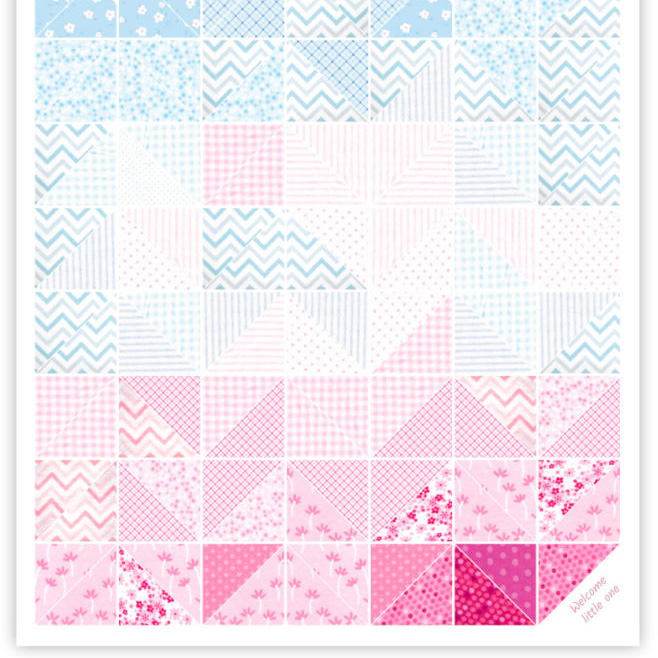
Baby quilt visualizing Earth's average surface temperature, 1880-2018

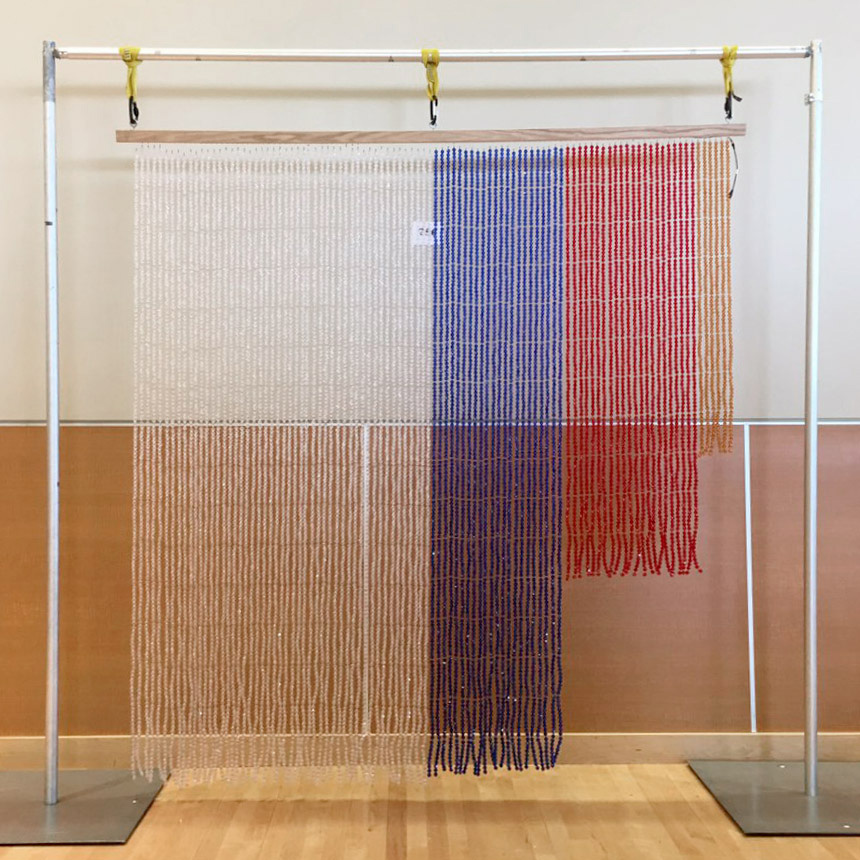
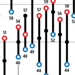
Bead curtain visualizing how all Washington residents voted in 2016, including those who can't or didn't vote

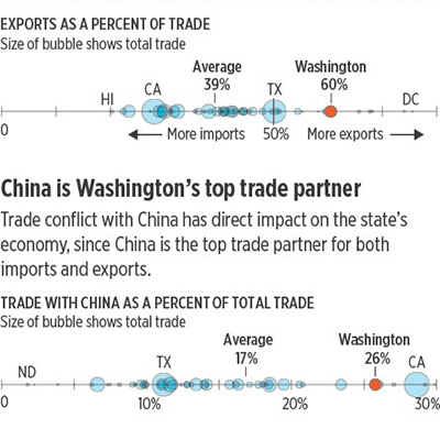
Washington depends on trade — and especially exports to China — more than other states do.

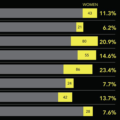
Women Photograph promotes women and underrepresented photographers, and they keep track.

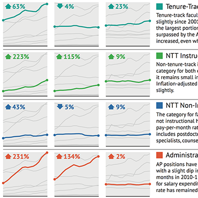
When the Excel charts from the Provost's Office don't answer Faculty Senate questions so you volunteer to make new ones...

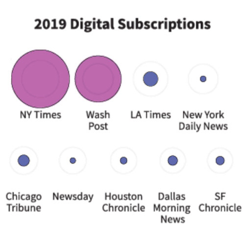
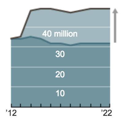
Visualizing NiemanLab print vs. digital subscribers as a gif and slopegraph

One of the most popular free beard icons on the entire internet and other contributions to The Noun Project.

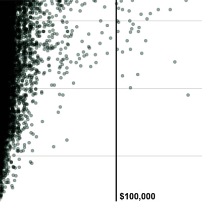
Under the current complicated tax code, companies pay a wide variety of rates.

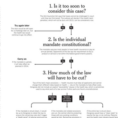
How the Supreme Court could have ruled on the health care law, and what it would have meant.

Estimate of how the upheld health care law could change insurance coverage.

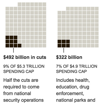
The nation's deficit crisis and the automatic cuts (if Congress still can't agree on a solution).

Three years after Kickstarter launched, a survey of its growth and projects.

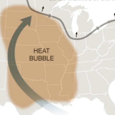
Explaining a weather phenomenon behind a miserably hot weekend. (As usual, blame humidity.)

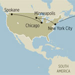
Tracking the candidates' post-convention campaign visits from swing state to swing state.

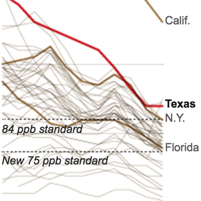
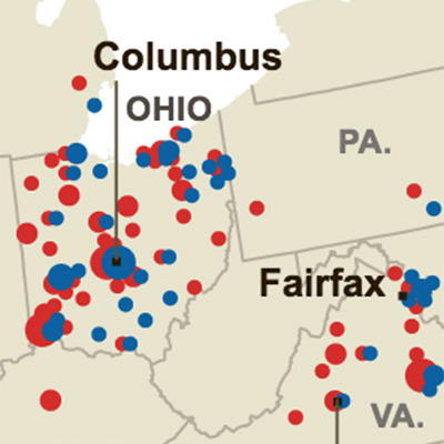
The EPA says Texas has a pollution problem. Texas says it's improving. Turns out they're both right.

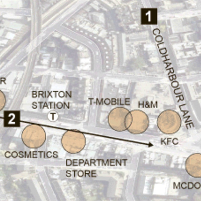
Trying to make sense of the London riots in August by taking a closer look at Brixton.

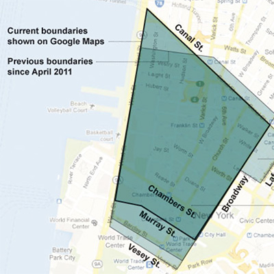
The old debates over NYC neighborhood boundaries, now on Google Maps.

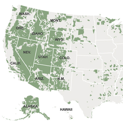
The federal government owns a whole lot of the West, which states don't always like.

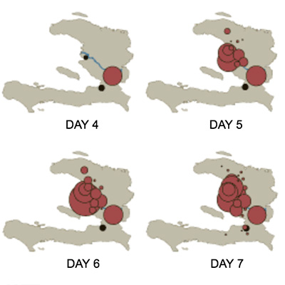
How the cholera epidemic in Haiti spread to the entire country within days of the first case.

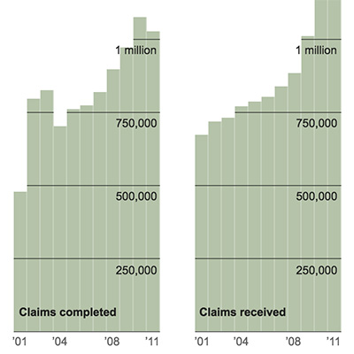
Despite a larger staff and budget to deal with the veterans' claims, the backlog keeps growing.

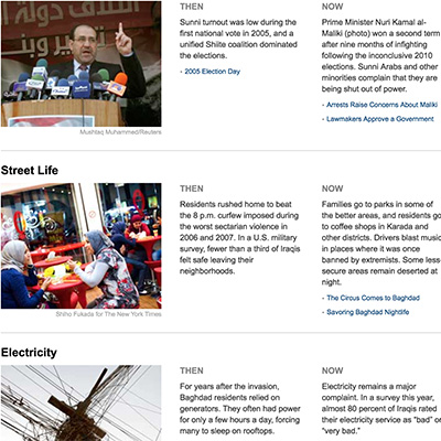
How things were going in Iraq as the U.S. military left in 2011.

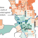
How Spokane County voted on same-sex marriage and marijuana legalization in the 2012 election.

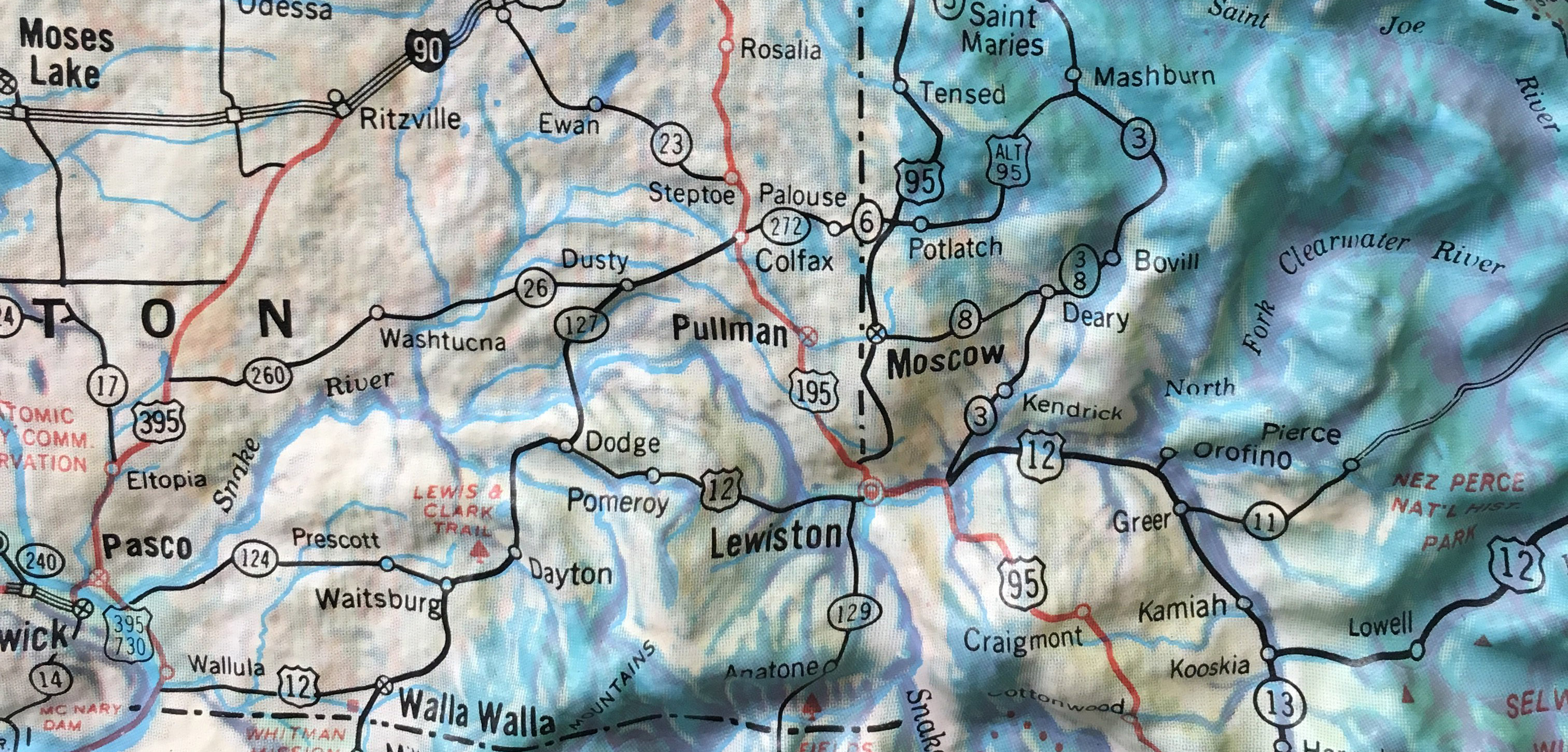
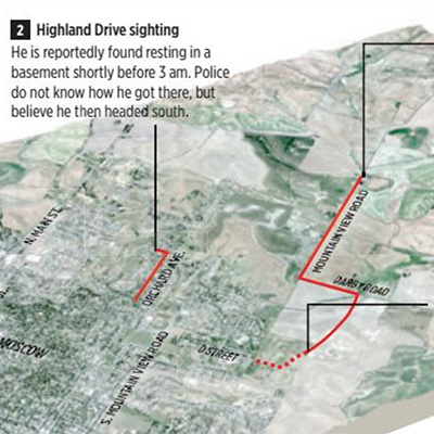
Retracing the path of a University of Idaho freshman who wandered out of town and never returned.

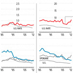
Looking deeper at local crime statistics to assess the perception that crime is getting worse.

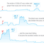
Snow may fall, but does it stick? This looked at how much snow Spokane has on the ground in past winters.

A map accompanying the story of a man who made a new life in Spokane after traveling from Africa as a refugee.

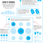
An introduction to how a fixed-price “restaurant week” works for Spokane’s first in 2013.

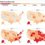
How a bad flu season started on the East Coast and spread across the country.

A history of the temperatures and weather conditions during the annual Bloomsday road race.

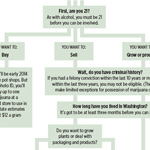
Initial proposed licensing rules for growers, processors and sellers in Washington state’s marijuana market.

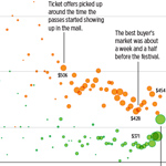
Tracking Craigslist supply and demand for tickets to the sold-out Sasquatch! music festival in 2013.

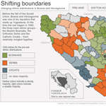
The ethnic distribution has shifted dramatically in Bosnia since the war, and this Flash graphic shows how.

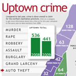
Crime decreased in uptown Manhattan in 2009, and this interactive for The Uptowner breaks down the stats.

An eminent domain battle near Columbia charted on deadline from city records.

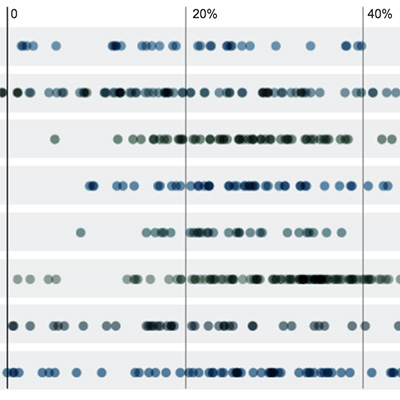
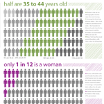
It turns out startup entrepreneurs are not a very diverse bunch, as this graphic shows.

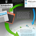
A quick explainer on the Wikileaks whistleblowing model from back when it was a new thing.

This graphic on media agencies was the last thing I ever made late at night at Columbia.

